Usage chart
The Usage chart inside the compute project tab visualizes how much of the project’s granted resources has been consumed over time.
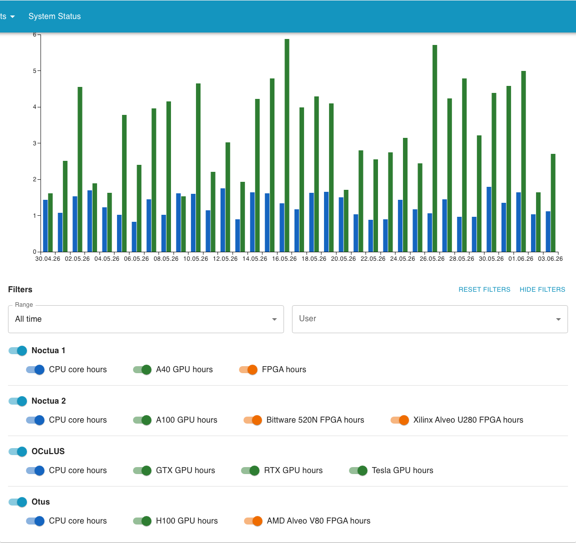
Filters
Section titled “Filters”Above the chart you find a row of controls that change what the chart shows:
- Range: restrict the chart to a specific time window. Useful when you want to focus on a recent month or compare two periods.
- User: only available to the principal investigator and person of contact. It lets you focus on a single user’s usage; it defaults to All users.
- Resource and cluster switches: toggle individual resources and clusters on or off to control which lines are shown.
Filters apply immediately, there is no separate confirm step. By default all of the project’s granted resources are shown.